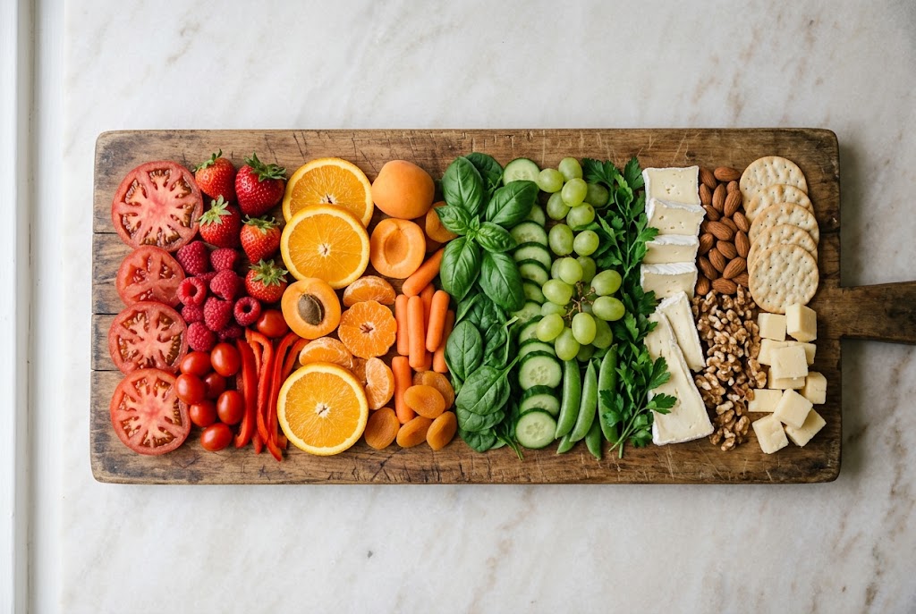
Quick Answer: Color sets flavor expectations before anyone takes a bite: green reads as fresh and tart, red as sweet or tangy, cream as mild and rich, amber as aged and savory. Garnishes like rosemary, grapes and cornichons do real work, so spread each color across the board instead of grouping it in one place.
The Science: Vision Precedes Taste
The visual cortex processes incoming information in roughly 150 milliseconds — faster than any other sensory system. When you see food, color information goes to the brain's object-recognition system, which has been trained since infancy to associate specific colors with specific flavor properties:
- Red/purple: Sweet (ripe berries, red grapes, pomegranate) or savory/umami (red meat, aged balsamic, bresaola)
- Green: Acidic and fresh (unripe fruit signal, herbs, pickles)
- White/cream: Neutral, mild, dairy
- Yellow/golden: Maillard-rich (roasted, caramelized, honeyed), slightly sweet
- Orange: Ripe fruit (moderately sweet), or spiced (orange rind, paprika)
- Dark brown/charcoal: Aged, fermented, complex (rye, dark chocolate, aged meats)
These associations are partly cultural, partly evolutionary (unripe fruit is green and bitter; ripe fruit is red/yellow and sweet), and they're surprisingly robust across individuals. They also directly influence taste perception: research by Charles Spence at Oxford's Crossmodal Lab has shown that changing the color of a food changes what people taste — a wine colored with an odorless red dye leads tasters to describe it using red fruit flavor descriptors, even when the wine's chemical composition is unchanged.
The implication for charcuterie boards: Color distribution on the board isn't just aesthetics. It's the first layer of flavor communication. A board with all muted, beige-cream tones tells the eye "mild, neutral, fatty" before anything is tasted. A board with green, red, golden, and cream distributed throughout tells the eye "contrast, variety, balance" — and activates anticipation in a way that makes the actual tasting more rewarding.
Reading the Board's Color Language
Here's how the color vocabulary maps onto flavor function on a charcuterie board:
Green: Acid Signal
Sources: Cornichons, Castelvetrano olives, fresh herbs (rosemary, thyme, basil), grapes, arugula, fresh dill, pesto
What green communicates: Freshness, acidity, palate reset. In evolutionary terms, green is associated with either bitter/unripe (caution) or fresh/herbal (safe). On a charcuterie board, green visually signals "this will cut through the richness." When guests see a cluster of grapes or a sprig of rosemary, they anticipate relief from the fatty richness of the cheeses and meats.
Functional role: Green elements are the visual markers for the acid-reset mechanism. Position them near the fattiest elements — near prosciutto, near a triple-cream Brie, near Gorgonzola — so the visual pairing suggestion matches the functional pairing logic.
What happens if green is absent: A board without any green reads as uniformly rich and heavy before anyone tastes it. Guests subconsciously expect no relief. Adding even a single rosemary sprig ($0.25 at a grocery store) changes this perception before the first bite.
Red and Purple: Sweet and Umami Signal
Sources: Red and purple grapes, fresh and dried figs, fresh strawberries, dried cranberries, cherry preserves, bresaola (the deep red-purple of myoglobin), aged balsamic vinegar
What red/purple communicates: Ripe sweetness (fruit) or savory depth (meat). In the context of a charcuterie board, red grapes and purple figs communicate that there's sweetness available — a dessert-adjacent note that balances the salt-forward elements.
Functional role: Red/purple fruit alongside salty, fatty elements is the visual signal of the sweet-savory contrast that makes charcuterie boards satisfying rather than one-dimensional. A board with no red or purple tones communicates "salty and fatty, that's it."
The bresaola note: Bresaola's deep red-purple color isn't just attractive — it signals its distinctive lean, mineral character before anyone picks it up. The dark color communicates "different from the pale pink prosciutto" and implicitly telegraphs that it will pair differently.
White and Cream: Neutral Base Signal
Sources: Cheeses (Brie, chèvre, fresh mozzarella, cream areas of Manchego), water crackers, cream-colored almonds, white pear flesh
What white/cream communicates: Neutral, mild, dairy-forward. It's the visual equivalent of a blank palate — the reset space on the board. White elements visually signal "this is where you start" or "this is the neutral base that makes the other elements more vivid."
Functional role: White and cream provide visual balance. Too little white on a board and it looks overwhelming and dense. A generous proportion of cream-toned elements (primarily the cheese) creates the visual baseline that makes the colorful accent elements pop.
Composition note: Cheese is naturally the dominant white/cream element. This is one reason cheese is the visual anchor of a well-built board — not because of its prominence but because its color signals "base, neutral, foundation" from a distance.
Golden and Amber: Maillard Richness Signal
Sources: Honey (especially drizzled), marcona almonds, toasted hazelnuts, amber ale (in a glass nearby), spiced walnuts, seeded crispbreads, the yellow-golden fat on prosciutto di Parma or coppa
What golden/amber communicates: Maillard-derived richness — roasted, caramelized, slightly sweet. Golden signals "this has been transformed by heat or time into something complex." Honey drizzled over aged cheese creates an amber visual accent that communicates both sweetness and the particular quality of aged richness.
Functional role: Golden elements identify the Maillard flavor territory on the board — the pairing zone where nutty, caramelized, roasted notes exist. Honey over aged Gouda. Marcona almonds near Comté. Spiced walnuts near Gorgonzola. These visual golden accents draw guests toward the compound-echo pairings you've designed.
The honey drizzle: A honey drizzle over aged cheese is the highest-ROI visual gesture on a board. It costs almost nothing, takes five seconds, and communicates sweetness, luxury, and the specific pairing you intend — all before anyone has touched anything.
The Color Distribution Principle
A board with each color zone isolated — all green on one side, red grapes on another, white cheese in the center — looks organized but doesn't create the dynamic visual flow that makes a board inviting. Better: distribute colors throughout the board so every area has contrast.
The rule: No large area of the board should be monochromatic. If you look at any quadrant of the board and see only one color family, something is missing.
Practical application: After placing the cheese (cream/white anchor) and charcuterie (pinks, reds, oranges), distribute the green elements (cornichons, herbs, grapes) and golden elements (honey, almonds) throughout all quadrants rather than in a single zone. The board should look varied from every angle.
Why Garnish Is Not Decorative
The common view of garnish on a charcuterie board — fresh herbs, edible flowers, extra dried fruit, artfully placed crackers — is that it's decoration. Making the board look nice.
This framing undersells what garnish actually does:
Rosemary: Forest green, linear form, strongly herbal aroma. It tells the eye "alpine, herbal, earthy" before the nose confirms it. Positioned near Comté or Gruyère (the alpine cheeses), it's a visual pairing suggestion. The same terpenes in rosemary (specifically camphene and pinene) occur in alpine pasture grasses that the cows eat — meaning the visual and aromatic suggestion is also a compound echo.
Fresh thyme: Similar to rosemary but more delicate. Works near softer, more floral cheeses (Brie, chèvre).
Edible flowers: If you use them (lavender, viola, nasturtium), they add a strong visual message of floral, delicate, premium. This elevates the perceived quality of everything around them without changing any other element. Visual anchoring works downward as well as upward — poor garnish signals poor quality; elegant garnish signals care.
Extra honey drizzle (final pass before serving): not only sweet. The amber pooling in the texture of aged cheese, catching the light — this is one of the most photographed elements of any well-built board. It's genuinely functional (the pairing) and genuinely beautiful.
The Board's Color Map
If you looked at a well-built charcuterie board and mapped the colors, you'd see:
- Large areas of cream/white: The cheese anchors. The neutral base that everything else references.
- Scattered green: Cornichons, grapes, herbs throughout. Distributed, not clustered.
- Distributed red/purple: Fruit, bresaola. The sweet/savory contrast markers.
- Golden accents: Honey drizzle, almonds, crispbreads. The Maillard zone markers.
- Pink/salmon/orange: The charcuterie. Arranged in a way that shows texture (rosettes, fans, ribbons) rather than flat stacks.
This map is both an aesthetic composition and a flavor communication system. Guests read it before they taste it. Making the map intentional is the same thing as making the flavor logic intentional — because your eyes were already primed before your tongue confirmed.
For more: see our board build sequence guide]([TO ADD]) for how to place these elements in the right order, and our [acid contrast science]([TO ADD]) for the flavor function of the green elements. Subscribe to the [Charcuterie Lab Report for weekly science and technique breakdowns.
Practical Color Distribution: A Working Framework
When assembling a board, a simple color check at the end of assembly can identify and fix contrast problems:
Step 1: Look for monochrome runs. Are there adjacent sections where three or more elements are all the same color range? These sections will read as visually flat.
Step 2: Break them up. Insert one element from a contrasting zone. A small pile of green grapes breaks an amber run. A few dark rye crisps break an ivory run. A dollop of white ricotta breaks a dark meat cluster.
Step 3: Check the perimeter. The edges of the board are where contrast most often fails — elements get pushed to the edge and tend to cluster with their tonal neighbors. A ring of grapes or herbs around the perimeter adds green and dark contrast at the edges.
Step 4: Assess from a distance. Look at the board from standing height, not leaning in close. From a slight distance, the color distribution is much clearer — you'll immediately see any sections that look visually dull.
The Specific High-Contrast Combinations That Work
These pairings contrast both visually and in flavor, which is part of why they show up on so many good boards:
Amber + Deep Purple/Dark: Aged Gouda (amber) next to dark dried figs or deep purple grapes. Visual contrast signals the flavor contrast (caramel sweetness vs. jammy, tannic fruit). This is the combination that appears on virtually every well-executed autumn board.
Ivory + Dark: Fresh chèvre log (ivory white) next to dark dried blueberries or dark salami rounds. The visual pop of the white against dark draws the eye and primes for the flavor contrast (clean lactic brightness vs. savory richness or fruit depth).
Pale Cream + Deep Red: Water crackers or sliced baguette (cream/pale) next to prosciutto (deep rose-pink-to-red). The complementary contrast is one of the most visually reliable on any board.
Green + Amber: Cornichons or green grapes (green) adjacent to aged cheddar or amber Gouda. The visual freshness of the green against the warmth of the amber signals the acid-rich palate reset that these elements actually provide.
Color Contrast at a Glance
| Zone | Elements | Board Function |
|---|---|---|
| Warm Amber | Aged Gouda, dried apricots, honey, aged cheddar | Richness, maturity, visual warmth |
| Ivory/White | Brie, chèvre, ricotta, water crackers, pear | Freshness, visual breathing room, contrast base |
| Dark | Prosciutto, dried figs, dark grapes, dark rye, olives | Visual weight, savory anchor, contrast pop |
| Fresh Green | Green grapes, herbs, cornichons, pistachios | Palate-reset signal, freshness, brightness |
FAQ
Does the color of food on a charcuterie board actually affect how it tastes?
Yes — visual cues significantly influence taste perception through a well-documented phenomenon called cross-modal flavor perception. The brain uses color as a predictive signal for flavor intensity before the food even reaches the palate. Deep red cured meat signals strong, savory flavor; bright red fruit signals sweet-tart; pale cheese signals mild and creamy. When color signals are absent or muted (as with colorless food), perceived flavor intensity actually decreases.
Why do colorful boards tend to be more enjoyable?
Multiple colors on a board signal flavor variety, which makes the eating experience more engaging. Variety in color typically reflects variety in flavor — and diverse flavor experiences are inherently more satisfying than monotonous ones. The color diversity also provides visual anchors that guide guests' exploration of the board, making each new element feel like a discovery.
What colors represent what flavor categories on a board?
Deep red/burgundy: aged cured meats (savory, umami). Pale cream/ivory: soft cheeses, mild flavors. Deep golden/amber: aged hard cheese, honey (sweet, complex). Bright green: herbs, grapes, cornichons (fresh, acidic). Purple-red: berries, dried fruits (sweet-tart). Orange/golden: honey, dried apricot (sweet). These aren't rigid rules — they're learned associations your guests already have.
Should you plan a board's color palette intentionally?
Yes — the best boards alternate colors so no two similar colors sit adjacent. This creates visual movement and ensures flavor variety is also distributed evenly. A practical approach: mentally divide the board into sections and ensure each section has at least 3 distinct color ranges. Then build out the flavor naturally within those color goals.
What is color contrast on a charcuterie board?
Color contrast refers to the deliberate placement of visually distinct colors adjacent to each other on a board — deep red bresaola next to pale ivory brie, bright green cornichons beside orange aged cheddar. The contrast serves both aesthetic and functional purposes: it makes the board more visually engaging and signals flavor diversity to guests.
Does visual contrast on a board actually improve the eating experience?
What food looks like affects what we expect it to taste like. A colorful, visually diverse board sets up an expectation of variety, which encourages guests to notice more. Guests who can see variety before tasting it tend to experience more flavor complexity — not because the food changed, but because expectation shapes perception.
How many distinct colors should a board have?
A minimum of five distinct colors provides good visual variety without becoming chaotic. More than eight to ten can start feeling cluttered. The key is contrast between adjacent elements — two similar colors next to each other read as monotonous even if the overall board has variety. Alternate the palette around the board so contrast is visible from any angle.
What are the highest-impact colors to include on a board?
Deep burgundy/red (bresaola, prosciutto) provides the strongest visual anchor. Bright green (herbs, grapes, cornichons) offers the highest contrast against warmer food tones. Honey golden provides warmth. Cream/ivory (soft cheese) provides the neutral that makes other colors pop. Jewel tones from berries, pomegranate, or dried fruit add richness.