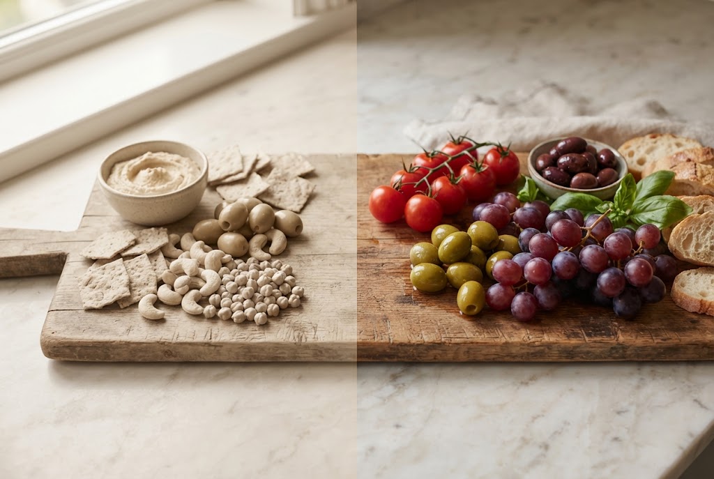
Quick Answer: Color contrast on a charcuterie board matters because what guests see sets up what they expect to taste, and contrast makes each item stand out. Place foods from different color groups side by side: amber aged Gouda next to green grapes, pale chèvre next to dark figs, prosciutto next to cream crackers. Break up any run of three similar colors.
Most advice about charcuterie board aesthetics is purely visual: "make it look nice." But the relationship between a board's appearance and how its food is perceived goes deeper than aesthetics. What food looks like shapes what you expect it to taste like, and that expectation colors the first bite.
Understanding the science of why color contrast matters allows you to design boards that aren't just visually appealing but are actually set up to taste better.
The Science: How Color Influences Flavor Perception
When you look at food, you start anticipating its flavor from what you see. Color is one of the strongest cues.
Color sets expectations: A deep red reads as ripe and rich, a pale cream reads as mild, and bright green reads as fresh and sharp. Those expectations shape what guests notice when they taste. The visual context is not separate from the eating experience; it is part of it.
Contrast drives attention: On a board with uniform color distribution (all pale elements together, or everything blending into the same tonal range), no individual element stands out for attention. Contrast creates focal points. When an amber-colored Gouda sits adjacent to a dark plum, both elements are more visually salient than either would be in a monochrome arrangement. An element that catches the eye tends to get more attention when it's eaten, too.
Expectation calibration: Color also sets flavor expectations that influence actual perception. A deep-amber Tawny Port placed adjacent to a pale Stilton wedge creates a visual anticipation of richness and complexity that primes the guest for the pairing. A pale water cracker placed against a white cheese with no visual differentiation provides no such priming — both elements visually suggest mild flavor before the first bite.
This doesn't mean that color alone changes the chemistry of the food. It means that flavor is a whole-senses experience, and what guests see shapes what they notice.
The Four Color Zones on a Charcuterie Board
A well-designed charcuterie board contains elements across four approximate color zones. When these zones are distributed with contrast (adjacent rather than clustered), the board provides maximum visual complexity and the most favorable perceptual environment for each element.
Zone 1: Warm Amber / Orange What falls here: aged Gouda, aged cheddar, Manchego rind, dried apricots, melon, honey, honeycomb, marcona almonds, orange-wax-wrapped cheeses
The amber zone registers as rich, warm, and complex. It's the visual signal most associated with aged, developed flavors — caramelization, concentration, maturity.
Zone 2: Ivory / White / Pale Cream What falls here: Brie paste, fresh chèvre, fresh ricotta, water crackers, sliced baguette, plain almonds, stracciatella, young Manchego interior, pears
The ivory zone registers as mild, fresh, and clean. It provides visual breathing room that prevents the board from feeling heavy. It's the contrast element that makes the amber and dark zones stand out more clearly.
Zone 3: Dark / Deep What falls here: prosciutto, bresaola, nduja, dried figs, dark grapes, dark rye crispbread, dark chocolate, Medjool dates, blackberries, olives
The dark zone registers as savory, rich, and complex. On a charcuterie board, it's where the visual weight of the cured meats lives. Dark elements make adjacent pale elements (fresh cheese, crackers) look brighter, and adjacent amber elements look richer.
Zone 4: Fresh Green What falls here: grapes (green), fresh herbs (thyme, rosemary), arugula, cornichons, pistachio nuts, green apple slices, fresh figs (cut to show interior)
The green zone registers as fresh, herbal, and acidic — the visual signal for palate-cleansing elements. Green elements serve a structural function on a board: they indicate to guests (before tasting) which elements will reset the palate, priming the expected sensory function before it occurs.
The Distribution Principle: Adjacent Contrast, Not Clusters
The principle for using these color zones effectively is not about how much of each color appears — it's about how they're arranged relative to each other.
High-contrast adjacency: Place elements from different color zones next to each other. Pale chèvre (Zone 2) next to dark dried figs (Zone 3). Amber aged Gouda (Zone 1) next to green grapes (Zone 4). Dark salami rounds (Zone 3) next to ivory water crackers (Zone 2). Each element becomes more visually distinct when its neighbor provides contrast.
Avoid monochrome runs: A section of the board where amber Gouda, sliced aged cheddar, dried apricots, and honey all sit together creates a warm-toned block where no individual element stands out. Breaking this up with a Zone 2 or Zone 4 element — a pear slice, a small pile of water crackers, a green grape cluster — restores contrast and visual interest.
The center vs. edge principle: Visually commanding elements (a whole Brie wheel, a large prosciutto fold, a dramatic wedge of blue-veined Stilton) work best as anchor points in the center or at significant positions on the board. Supporting elements fill around them. This creates a visual hierarchy — the eye knows where to start.
Practical Color Distribution: A Working Framework
When assembling a board, a simple color check at the end of assembly can identify and fix contrast problems:
Step 1: Look for monochrome runs. Are there adjacent sections where three or more elements are all the same color range? These sections will read as visually flat.
Step 2: Break them up. Insert one element from a contrasting zone. A small pile of green grapes breaks an amber run. A few dark rye crisps break an ivory run. A dollop of white ricotta breaks a dark meat cluster.
Step 3: Check the perimeter. The edges of the board are where contrast most often fails — elements get pushed to the edge and tend to cluster with their tonal neighbors. A ring of grapes or herbs around the perimeter adds green and dark contrast at the edges.
Step 4: Assess from a distance. Look at the board from standing height, not leaning in close. From a slight distance, the color distribution is much clearer — you'll immediately see any sections that look visually dull.
The Specific High-Contrast Combinations That Work
These pairings contrast both visually and in flavor, which is part of why they show up on so many good boards:
Amber + Deep Purple/Dark: Aged Gouda (amber) next to dark dried figs or deep purple grapes. Visual contrast signals the flavor contrast (caramel sweetness vs. jammy, tannic fruit). This is the combination that appears on virtually every well-executed autumn board.
Ivory + Dark: Fresh chèvre log (ivory white) next to dark dried blueberries or dark salami rounds. The visual pop of the white against dark draws the eye and primes for the flavor contrast (clean lactic brightness vs. savory richness or fruit depth).
Pale Cream + Deep Red: Water crackers or sliced baguette (cream/pale) next to prosciutto (deep rose-pink-to-red). The complementary contrast is one of the most visually reliable on any board.
Green + Amber: Cornichons or green grapes (green) adjacent to aged cheddar or amber Gouda. The visual freshness of the green against the warmth of the amber signals the acid-rich palate reset that these elements actually provide.
Color Contrast at a Glance
| Zone | Elements | Board Function |
|---|---|---|
| Warm Amber | Aged Gouda, dried apricots, honey, aged cheddar | Richness, maturity, visual warmth |
| Ivory/White | Brie, chèvre, ricotta, water crackers, pear | Freshness, visual breathing room, contrast base |
| Dark | Prosciutto, dried figs, dark grapes, dark rye, olives | Visual weight, savory anchor, contrast pop |
| Fresh Green | Green grapes, herbs, cornichons, pistachios | Palate-reset signal, freshness, brightness |
FAQ
What is color contrast on a charcuterie board? Color contrast refers to the deliberate placement of visually distinct colors adjacent to each other on a board — deep red bresaola next to pale ivory brie, bright green cornichons beside orange aged cheddar. The contrast serves both aesthetic and functional purposes: it makes the board more visually engaging and signals flavor diversity to guests.
Does visual contrast on a board actually improve the eating experience? What food looks like affects what we expect it to taste like. A colorful, visually diverse board sets up an expectation of variety, which encourages guests to notice more. Guests who can see variety before tasting it tend to experience more flavor complexity — not because the food changed, but because expectation shapes perception.
How many distinct colors should a board have? A minimum of five distinct colors provides good visual variety without becoming chaotic. More than eight to ten can start feeling cluttered. The key is contrast between adjacent elements — two similar colors next to each other read as monotonous even if the overall board has variety. Alternate the palette around the board so contrast is visible from any angle.
What are the highest-impact colors to include on a board? Deep burgundy/red (bresaola, prosciutto) provides the strongest visual anchor. Bright green (herbs, grapes, cornichons) offers the highest contrast against warmer food tones. Honey golden provides warmth. Cream/ivory (soft cheese) provides the neutral that makes other colors pop. Jewel tones from berries, pomegranate, or dried fruit add richness.